A supporter who reaches your donation form has already made several decisions. They noticed your appeal, connected with the mission, and chose to act. The form’s job is to carry that motivation across the finish line with as little uncertainty as possible.
The strongest donation experiences are not aggressive. They are clear, fast, trustworthy, accessible, and reliable. This guide explains nonprofit donation form best practices that a small team can implement without rebuilding its entire fundraising platform.
Start with one campaign promise
Donation pages perform a specific job: connect a gift to an outcome. Place a concise statement near the form explaining what the campaign supports and how a contribution helps. Avoid making donors search through navigation, annual reports, or program pages to rediscover the reason they clicked.
Specificity builds confidence, but invented precision damages trust. If fifty dollars genuinely funds a defined item or service, say so. If funds support a broader program, describe the program honestly rather than assigning a symbolic outcome that accounting cannot substantiate. The message, form, receipt, and follow-up should all describe the same purpose.
- Name the program or need in plain language.
- Show one credible example of impact.
- Keep the primary call to action focused on giving.
- Remove unrelated promotional blocks from the checkout path.
Make the first decision easy: amount and frequency
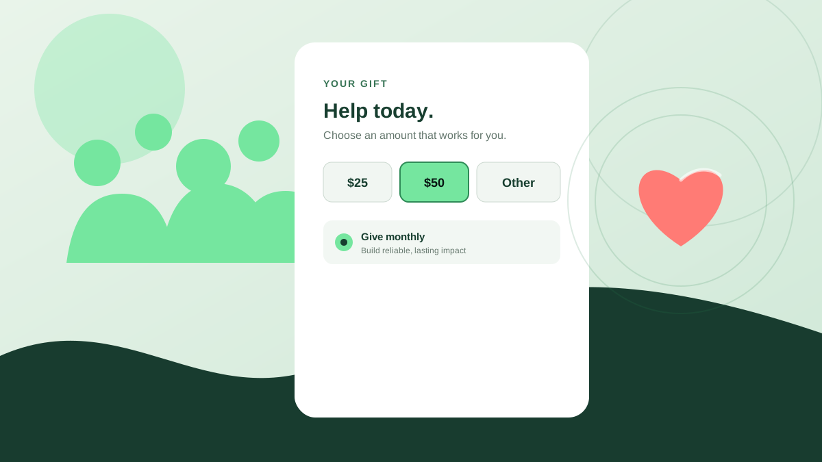
Suggested amounts reduce decision effort. Offer a short set based on real giving patterns, plus an “other amount” option. Explain impact beside amounts only when the relationship is accurate and easy to understand. Preselecting an amount can help momentum, but the choice must remain obvious and easy to change.
Offer one-time and recurring giving without disguising either option. Recurring donations can improve predictability and deepen long-term support, while one-time gifts remain the right choice for many donors. Stripe’s nonprofit guidance emphasizes flexible schedules, donor management, and recovery of failed recurring payments. The important design principle is informed choice, not forcing a monthly commitment.
Action checklist
- Show three to five suggested gift amounts and a custom option.
- Make one-time and monthly choices equally understandable.
- State the billing frequency beside the amount and again before confirmation.
- Explain how donors can update or cancel recurring gifts.
Ask only for information you will use
Long forms create hesitation, especially on mobile. Collect what is required to process the payment, issue a receipt, meet legal obligations, and maintain the donor relationship the person requested. Move optional questions—such as motivation, tribute details, employer matching, or demographic information—after the essential transaction when possible.
Every field creates responsibility as well as friction. If your organization collects a phone number, birth date, or detailed personal story, it must protect that information and explain its purpose. Data minimization is both a conversion principle and a privacy practice. Fewer unnecessary fields mean fewer decisions for the donor and less sensitive information for the nonprofit to manage.
- Separate required payment and receipt data from optional stewardship questions.
- Mark optional fields explicitly.
- Do not require account creation before a first gift.
- Explain why unusual information is needed at the point of collection.
Design for a donor using one thumb
A mobile donation form should not feel like a desktop form squeezed into a narrow column. Use a single-column flow, readable text, generous spacing, and input types that open the correct mobile keyboard. Keep labels visible after typing begins. Buttons should be large enough to tap confidently and should not sit beside destructive actions such as cancel or reset.
WCAG 2.2 includes a Level AA target-size criterion intended to reduce accidental activation of small, crowded controls. Accessibility also requires visible labels, meaningful error messages, logical keyboard order, sufficient contrast, and status updates that assistive technologies can announce. These improvements help donors with disabilities and reduce confusion for everyone completing the form under real-world conditions.
Action checklist
- Test at 320 CSS pixels wide and at 200% browser zoom.
- Use visible labels and appropriate autocomplete attributes.
- Keep tap targets at least 24 by 24 CSS pixels or sufficiently spaced.
- Test the entire flow with a keyboard and a screen reader.
- Do not impose a short timeout on the donation process.
Build trust at the exact moment doubt appears
Donors evaluate risk while entering payment information. Show the organization’s recognizable name, secure connection, concise privacy explanation, and contact information. If a payment processor hosts the checkout, preserve enough branding and context that the transition feels intentional. Avoid decorative security badges that do not represent a real certification or practice.
Be transparent about fees. If donors may cover processing costs, present the option clearly, explain how it is calculated, and avoid preselected choices that could surprise them. Show the final amount and frequency before submission. A donor should never need to inspect a receipt to discover what they agreed to pay.
- Use HTTPS on the donation page and every step of checkout.
- Display the legal organization name and a working support contact.
- Link a readable privacy notice near the form.
- Show the final total, currency, and frequency before confirmation.
- Never imply that optional fee coverage is required.
Treat confirmation as part of the gift
After payment, replace uncertainty with a clear success message. State that the donation was received, show the amount and frequency, explain when the receipt will arrive, and provide a support path if anything looks wrong. Do not rely solely on email; delivery can be delayed or filtered.
The confirmation page is also a stewardship moment. Thank the donor in language consistent with the campaign, briefly reconnect the gift to impact, and offer one optional next step such as sharing the campaign or learning about the program. Avoid immediately covering the thank-you with another donation request or a long set of competing actions.
Action checklist
- Show an on-screen confirmation with a transaction reference.
- Send an accessible email receipt promptly.
- Confirm recurring frequency and management instructions.
- Provide a real contact for corrections or receipt questions.
Measure a donation funnel without collecting more than you need
Measure page views, amount selection, form starts, payment attempts, completed gifts, recurring selection, and confirmed receipts. Google Analytics supports custom events and parameters, including donation-related actions, but analytics configuration must respect your consent and privacy obligations. Never send card details, personal messages, or other sensitive donor data into general analytics tools.
Look at completion by device, campaign, and traffic source. A low mobile completion rate may point to layout, keyboard, speed, or payment-method friction. A gap between payment success and receipt delivery signals an operational problem rather than a marketing problem. The useful question is not simply “How many people clicked donate?” but “How many intended gifts became confirmed, stewardable donations?”
- Donation-page view to form-start rate
- Form-start to payment-attempt rate
- Payment-attempt to confirmed-gift rate
- One-time versus recurring selection
- Receipt delivery and failed-payment recovery
- Completion rate by mobile, desktop, campaign, and source
Test the complete donation journey before every campaign
Run a real low-value transaction in production before a major email, event, media appearance, or year-end campaign. A sandbox test proves configuration in a test environment; it does not prove that the public page, live payment credentials, fraud settings, integrations, receipts, and accounting destination work together.
Repeat the journey using mobile and desktop, one-time and recurring options, valid and declined payment scenarios, and different email providers. Confirm the gift appears in the payment system and donor database, the correct campaign receives attribution, the receipt arrives, and cancellation or refund procedures are documented. Schedule recurring checks during active campaigns because software and connected services can change after launch.
Action checklist
- Complete a small live gift and verify it in every connected system.
- Test one-time and recurring flows separately.
- Test declined-payment and validation messages.
- Confirm campaign attribution, receipt delivery, and donor records.
- Recheck during high-volume campaigns—not only before launch.
A better form supports a better relationship
Donation optimization is not about squeezing more money from a visitor. It is about removing avoidable barriers between generosity and impact. A concise form respects attention. Accessible controls respect different abilities. Transparent totals respect informed choice. Reliable confirmation respects trust.
Start with the highest-risk gaps: complete a mobile donation yourself, verify the gift at every destination, remove one unnecessary field, and make the confirmation explicit. Then measure the funnel and improve one friction point at a time. Small nonprofits do not need every fundraising feature; they need a giving experience supporters can understand and depend on.
Trusted resources
These external references informed the recommendations above and provide authoritative implementation detail.
- W3C Web Accessibility Initiative: Forms Tutorial
Accessible form structure, instructions, validation, and notifications.
- W3C: What’s New in WCAG 2.2
An overview of newer criteria including minimum target size.
- Stripe: Online giving explained
A useful overview of focused donation pages, recurring gifts, mobile design, and confirmation.
- Google Analytics: Custom events
Official guidance for measuring actions such as donations without relying only on pageviews.
Common questions
How many fields should a nonprofit donation form have?
There is no universal number. Collect only what is required to process the gift, issue a receipt, meet obligations, and deliver requested stewardship. Move optional questions after the transaction where possible.
Should monthly giving be preselected?
A preselection may increase recurring gifts, but frequency must be prominent, understandable, and easy to change. The donor should see the frequency and final total again before submitting.
How should a nonprofit test its donation form?
Complete a small live transaction on mobile and desktop, then verify the payment, donor record, campaign attribution, on-screen confirmation, email receipt, and any connected accounting or CRM workflow.